CASE STUDY:
Album Pre-Order: RESPONSIBE WEB, MOBILE, AND APP
To demonstrate my experience in the UX and UI design process, I have broken down the process from start to end of a mobile app I designed to pitch to clients.
PROJECT QUICK FACTS:
- The Product: An album purchasing app where users can easily purchase albums and gain access to exclusive content made by the artist after the purchase.
- Prospective Clients: Record stores that sell physical vinyls and retail, and want to grow or improve an online presence.
- Duration: I developed this design project over an intensive 3 weeks, from the first user research survey to the final high fidelity prototype.
THE PROBLEM:
Options to buy physical albums, vinyls and merchandise are now very limited after widespread closures of record stores and venues in 2020. Music fans and collectors need a reliable and convenient way to buy, trade, and connect with each other too in the community.
THE GOAL:
To provide a reliable way for fan to purchase records, for artists to make content, and create opportunities for all in the community to connect with each other. The exclusive content would motivate people to use the app and make a purchase.
MY ROLE:
Visual, Interaction, and Motion design. I completed all aspects in this portfolio case study, wearing the hats of a UX researcher and a UX Designer. This means I conducted the initial user research, created wireframes and prototypes on Figma, conducted the usability studies after the prototypes. I also did the UI design utilizing design systems and incorporating colour and type for the high fidelity mock ups and prototype.
STAGE 1: USER RESEARCH
For my initial research before making a prototype, I sent a list of questions to 5 people of varying demographics to find out more about their purchasing habits and how they use apps, or what may deter them from using apps. It was assumed that the participant had a smartphone with capability to download apps, internet access, and access to online payment methods. The pain points discovered were the following:
1. Payment Method: Users were distrusting of apps that asked them to enter payment details directly. Users only made in-app purchases if they could pay via Apple Pay, Google Pay, or a third party app. This influenced the inclusion of third party payment in the app.
2. Advertisements: Users didn't like using apps with advertisements, particularly those that weren’t matched to their interests. This influenced a user flow where an album purchase was required before accessing content. In essence, this meant it wasn’t a free app.
3. Personal Info: Users didn’t like giving their email addresses to sign up to apps or having to remember passwords. They wanted to be able to track how their data was being used. The app was designed without the need for any sign up function at all.
4. Users offloaded apps they didn’t engage with often, or had content they weren’t interested in. This led to a post purchase content experience with content matching their interests.
STAGE 2: THE DESIGN PROCESS - WIREFRAMES
1. Paper Wireframes

2. Paper to Digital Wireframe

3. Digital Wireframes

Features incorporated from user research

4. Low Fidelity Prototype + User Flow (Interaction Design)

STAGE 3: USABILITY STUDIES
I conducted a moderated usability study via Zoom with five participants in varying demographics, but of the target audience for the album purchasing app. The research goals were to find out whether the purchasing user flow is easy and manageable, and whether users are attracted to engaging with the post-purchase features on the app such as content and chat forums.
FINDINGS:
1. The previous purchases button was difficult to locate on screen
2. The purchasing user flow is easy to navigate
3. More ‘tap’ functionalities should be included, eg tap off layovers
4. Header logo should link back to home
5. Images should be larger, and less on one page. Add scroll functionality.
6. Users appreciated that buttons are clearly labelled with words
STAGE 4: ITERATIONS TO LO-FI MOCK UPS
Priority (P0) Iteration:
In the first prototype, the buttons were spread across the top and bottom of the screen. The study showed users liked the way the buttons used words instead of icons, but still found it confusing to have buttons on both sides and wanted the buttons all in one place. I created a “menu” to make this happen, so it was still using words but all in one place.
Image: Before usability study versus after usability study
Priority (P2) Iteration:
In the first prototype, the layout for album images were smaller. Study showed users wanted more emphasis on imagery for what they were purchasing, so I incorporated scale and proportion to be able to add emphasis.
Image: Before usability study versus after usability study
STAGE 5: HIGH FIDELITY MOCK UPS
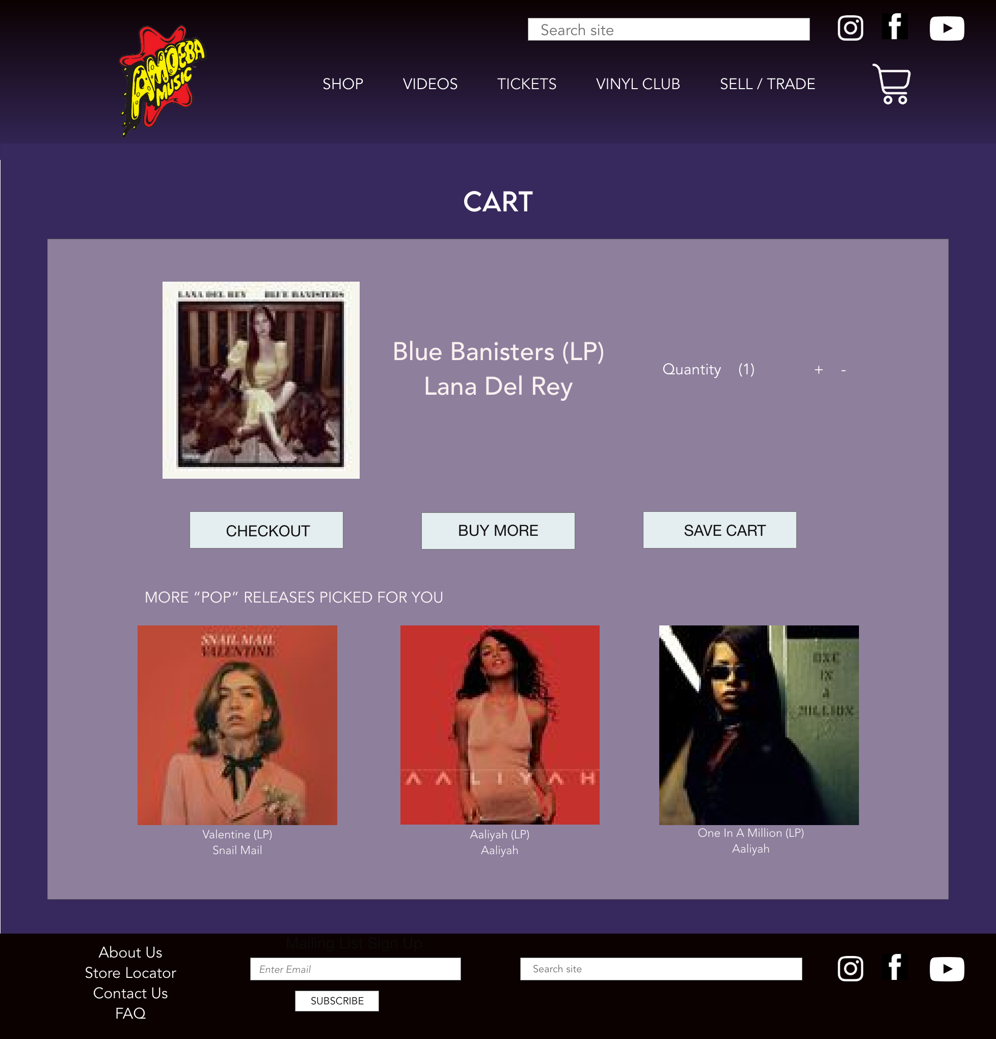
NB For the high-fidelity mock ups, I have used Amoeba Records logo here as a 'dream client' in mind during the design to exemplify how it may look in the context of a real record store. (Please note all logos and images are for portfolio purposes only to demonstrate the prototype!)

STAGE 6: HIGH FIDELITY PROTOTYPE + USER FLOW

STAGE 7: ADOBE XD - HIGH FIDELITY WEB AND RESPONSIVE MOBILE VERSION
Speculative pitch - Re-design of Amoeba Records' website
STAGE 8: ADOBE XD - COMPLETING USER FLOW FOR WEB RE-DESIGN


